This post was originally published July 12, 2018 and was updated October 26, 2021.
Above vs. below the fold
We understand that you’ll want your website visitors to get the relevant details of your offering as soon as possible. But for many, this ask comes in the form of, “Can you put everything at the top so visitors don’t have to scroll? I want everything important to be above the fold.”
Why do we still get that request?
A bit of history
The expression “above the fold” is originally a newspaper term that referred literally to the separation of the upper half and lower half of a broadsheet page. When folded in half and displayed on the newsstand, only the top half—“above the fold”—was visible. Therefore, editors put the most newsworthy and compelling content there in an effort to entice potential buyers.
Web designers adopted this idea in the early days of the Internet. Given early websites and web design, it made some sense. Eventually, this “above the fold” concept turned into a mantra along the lines of, “put as much content as you can at the top of the screen or no one will see it!”
So much has changed with online and digital technology, though, that this line of thinking now outdated.
With modern laptops and the arrival of smartphones and tablets, the way people consume information and navigate the Web is forever changed. In stark contrast to “the early days,” smartphones and high-resolution displays actually encourage users to explore by scrolling and swiping.
Screen resolution
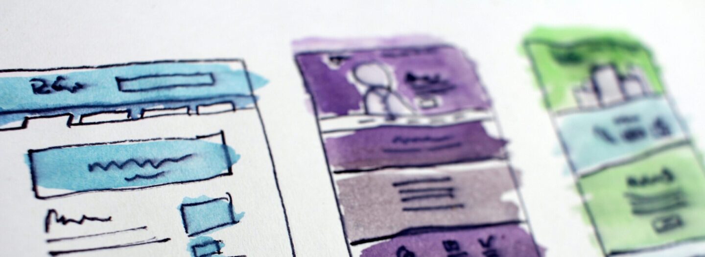
Older monitors were typically designed to accommodate 800 x 600 or 1024 x 768 pixel resolutions; monitors today now can reach above 2560 x 1600 pixels! What’s more, no user’s fold location is the same. Trying to design for an “average” fold location means that those with a higher-than-expected resolution screen will see more than what is intended, with the opposite being true for those with a less-than-expected resolution screen. Modern web designers have met this challenge with a technique called “responsive web design.” The content reacts and re-aligns based on screen resolution and/or browser size. It shows the users the most important content first, encouraging them to scroll down to see the rest.
But wait: how do we know that they’ll scroll?
Users do scroll.
And in fact, they prefer to scroll in order to continue reading vs. being forced to click through page to page to read content. Thanks to the invention of the mouse scroll-wheel and laptop gestures, we no longer have to deal with trying to click, grab, and drag a clunky scroll bar on a browser window. There is sufficient evidence that people are now scrolling more than ever; according to one study, as many as 22% will scroll all the way down to the bottom of a page before leaving a site (source: UX Myths).
At a(m), too, we’ve found the same. Time after time, our own A/B tests show stronger conversions (sometimes significantly so) on longer pages that scroll as opposed to shorter pages that have the same content presented all at the top of the page.
Why is this good?
From a design standpoint, it is so much more fun to be able to utilize the entire screen area to showcase content in more enticing ways. We’re not suggesting you should fill your site with never-ending blocks of text and images. But, if you design a compelling page layout and it runs long – it’s OK! People will scroll—provided what you put lower on the page is worth scrolling for. It’s important is to have compelling headlines and imagery to draw your visitors in and make them want to learn more. Let your site tell them a story as they explore all the goodies that lie below the fold.
What does it mean?
Because we no longer have to worry about a page fold, modern practices prevail and your web designs can become much more impactful:
- More vertical (and horizontal) white space – Instead of reading articles pushing you toward voice search or a Pinterest account, step back and focus on WHY the things that worked well played out as they did.
- More room for visual expression – Large imagery and typography encourage scrolling. Leave things peeking, or start animations as a user navigates. It gives us so much more room for interactivity.
- Responsive design – The benefits are obvious: You build a website that works seamlessly across thousands of different screens. Old web designs were “boxy” and very restricted. Now we’re designing outside the box.
But don’t throw the baby out with the bathwater.
Above the fold design does still have its place. If you absolutely want people to see it, you put it right there at the top, front, and center. But then place content in an order that makes sense. Create a rhythm (visually and contextually) that flows from most important on top down to least important. This “visual hierarchy” allows the user’s brain to easily grasp the content of the page—the entire page. Bad design with no flow leaves users feeling confused and even agitated.
The content you do put above the fold should hook the user into viewing the rest of the site. Ultimately, it should accomplish three things:
- Establish the brand
- Capture interest
- Include primary keywords for SEO purposes
Further reading
In our research on design trends, just about every article we’ve read asserts that the fold is no longer relevant for website design considerations. Most cutting-edge designers believe this, too—and it shows in their designs.
If you’re interested in learning more and seeing some above-and-below-the-fold design examples, check out these resources:
Is Staying “Above the Fold” Still Relevant in Website Design?
Why “The Fold” Is a Myth – And Where To Actually Put Your Calls To Action